Monday, December 9, 2013

Final project 2 maze upgrade


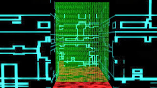
For the second upgrade I decided to upgrade my maze from the simple maze to the medium maze. It is larger and more complicated than the simple maze. I also upgraded the key and changed the enemies slightly.

This is an overall view of the maze. The enemies can be seen in the corners.


This is a closeup on a hallway.


This is a closeup image of the door.


This is a closeup image of the key.

Final project 1 title screen

The First project I upgraded is my title screen. I added the upgraded logo and the upgraded tree. The tree gradually looses its leaves, and the moon does not disappear completely but gradually becomes a new moon, as that happens the screen gets darker. I also smoothed out the animation of the moon and the leave. Overall I think it came out well, and improved from the original.

Thursday, December 5, 2013

Final Project concept phase

For my final project I will be upgrading my title screen by adding the updated logo, and smoothing out the animation. I don't plan on changing the overall style of the title screen, but I may add some things such as the upgraded tree from my earlier project.

Monday, December 2, 2013

Assignment upgrade 2

I think this new logo is more interesting than the old one. The old one was just an ordinary block with a title on it. For the upgrade I changed the overall shape and added a full moon to the background. I may or may not incorporate this logo into an upgraded title screen.

Wednesday, November 20, 2013

Logo upgrade research phase

 This week I wanted to upgrade my logo design. I mostly want to make the general shape more complex so I am using the Castlevania logo for reference. I might also experiment with a different font, and some sort of texture on the moon.

Monday, November 18, 2013

Pixel assignment upgrade

 For the upgrade I decided to make the tree less symmetrical. I also added vines using maya. I decided to keep some color in the vines so that they would stand out and actually look like they are supposed to. Overall I think it came out better than the original, but not necessarily perfect.


Upgrade


Original

Wednesday, November 13, 2013

Upgrade Research


The project I plan on updating is the pixel building project. For that project I did a large dead tree. To upgrade it I plan to make it less symmetrical and more natural looking. For the reference image I used artwork of Faron Woods from The Legend of Zelda Skyward Sword. I plan to keep the original color scheme of black white and grey, but I plan to add more detail to the tree and the background.

Monday, November 11, 2013

Maze texturing final phase


For the final project I didn't really add anything texture wise because I was happy with what I had, I just improved the overall lighting, and added two props. The green sphere acts as the key, and it is the same code texture as the locked door just less transparent. The other sphere acts as an enemy the player must avoid. It is a simple grid texture with the fire paint affects added.

Wednesday, November 6, 2013

Maze upgrade research phase


For upgrading the maze, I decided to make it more like The Space Paranoids in Kingdom Hearts 2, and The Grid in Kingdom Hearts 3d. Both of the worlds are based on the Tron franchise, which seems to fit with the theme of my maze project. Overall I plan on improving the lighting and colors of the maze.

Monday, November 4, 2013

Final Maze


I went with the easy maze design, because I had the most work done on it. I think it came out well. As planned I used the blue texture for the walls, the and the red texture for the floor. I decided to use a different texture for the ceiling which can be seen over the unused areas of the maze.

Wednesday, October 30, 2013

Wk10 Maze Modeling Concept Phase

 My walls, floor, and door are above. I used red texture for the floor (and plan on using it for the ceiling) The blue texture for the walls, and the green code for the doors. I decided to make the doors slightly transparent because I thought it would look better


Monday, October 28, 2013

Wk09 Maze Design Final Phase

Story: You are a computer virus trying to hack your way into a government computer. You must navigate through the maze, find the passwords to get past the firewall while simultaneously avoiding the anti-virus software.

I decided to do a blue grid pattern for the walls, and a red grid pattern for the floor and ceiling. I plan on using patches of binary code for the locked doors that the player has to get past.

Wednesday, October 23, 2013

Maze concept

Story: You are a computer virus trying to hack your way into a government computer. You must navigate through the maze, find the passwords to get past the firewall while simultaneously avoiding the anti-virus software.

For the texture I was thinking of doing the blue grid for the floors and ceiling, the red grid for the walls, and the binary code for the firewall. The passwords that are needed to get passed the firewall might be simple phrases of text.

I was thinking of making the anti-virus software shaped like the heads of government agents.


Monday, October 21, 2013

Pixel building

I chose to do a simple dead tree. The colors are primarily white and various shades of grey for the shadows, on a black background. Many of the levels will take place in forests so the player will see a lot of trees.

Wednesday, October 16, 2013

Building research phase


 For the research phase, I drew inspiration from Barad-dur from the Lord of the Rings, and Ganon's tower from the Legend of Zelda. Both towers have a dark and ominous feel to them. The tower level is likely to be the final level/levels in the game.
Below is a rough pixel outline of the tower, I used Barad-dur as the template and traced along.


Pixel prop final phase.

This is the final product for the pixel prop. The shading on the blade was really easy as it was just 2 shades of grey, and a shade of white. The sword hilt is just a few shades of blue, I also decided to change the pattern on the handle itself.  

Monday, October 14, 2013

Pixel art research phase

 For the reference image I used the Master Sword from the Legend of Zelda. The sword is one of the weapons used in the game, it is a light based weapon. The color scheme will be black, white, grey and glowing light blue. Below is the sketch of the sword that i did, it will likely be smaller and less detailed in the final project.   

Monday, October 7, 2013

Logo design final

 For the final version of my logo I decided to go with my third thumbnail sketch, I also added a red boarder. I also decided to make the text in the moon red so that it stands out. The red N in front of the moon can be thought of as another sort of logo for the game. For the title animation the logo just replaces the ordinary title.  

Wednesday, October 2, 2013

Logo concept


 I took inspiration for my logos from various games from the Legend of Zelda series. I want to have either the moon depicted in the background, or the gauntlet behind part of the text. The moon would work well because it is part of the environment for the game. The gauntlet would also work well because it is one of the main gameplay aspects.

Monday, September 30, 2013

Wk05 Logo Design Final Phase

So here is my final title screen. I did not change much from the concept images. The only things I added is the menu, which is in a standard three part format with a red diamond shaped cursor. The animations are pretty simple, just the moon changing phases and leaves and grass blowing in the wind.

Wednesday, September 25, 2013

Wk05 logo design concept phase


The title screen I took inspiration from is Xenoblade Chronicles. The title screen is fairly simple. It shows mostly the environment, and a main gameplay aspect in the center of the screen.

For my title screen, I decided to show a moonlit field, with a tree in the background. For animation, the moon will gradually change phases, and the wind will blow through the grass, and shakes leaves from the tree. The background is the moon and sky. The mid-ground elements are the tree and the grass. The foreground element is the logo.

Monday, September 23, 2013

Wk04 Mood board final phase

 The color scheme stayed the same because it is mostly black, white, and grey. The common graphics that I added to each the crescent moon in the corner, and the white grass on the bottom. The moon and the grass relate to what the environment will look like in the game. I also removed the picture in the environment mood board, and replaced it with a picture of a haunted forest. Many of the first levels will take place in a similar environment.


Wednesday, September 18, 2013

Wk04 Mood Board Concept Phase

This is a mood board for Castlevania: Lords of Shadow. It is a very dark game with Gothic elements. The colors are mostly dark with the exception of the highlights towards the center of the image. The game is one of my favorites, and many of the concepts inspired the game I am currently working on. Since the game is very dark it is only natural that it uses dark colors.


Next is the mood board for the gauntlet. The gauntlet will most likely be the color of dark worn-out metal. The gem in the center will be clear when not in use, and will change color depending on the attack.


The basic color scheme for the environment will be different shades of black and white. The only color will be supplied by things the player can interact with such as enemies or treasures.


The antagonists will be wearing dark cloaks, and possibly white masks. Color will come in during boss fights but only for their attacks. Other than that its pretty much the same dark color scheme.


As I'm sure you noticed by now all of these pictures have the same color schemes. Black background, white text, and red header. The only variation comes from the outside pictures. So the color scheme for the game will most likely follow this pattern.